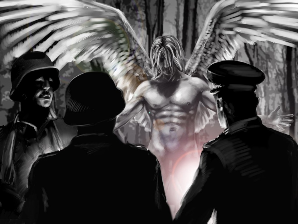
While the conceptual development process for a graphic novel may be complex, it’s also a vital first-step in bringing Holy Land: Resistance to completion.
Below, we have shared some conceptual designs. Some are for our reference, being images that are unlikely to appear in the finished article but which provide a starting point in the development of the graphical style. Others will appear in the completed novel in one form or another, but are here presented in a way which – we hope – explores the visual style without tainting a reader’s experience.
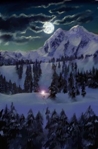
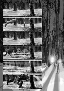
We’ve also included some samples of completed artwork (minus exposition and dialogue) to give an idea of how the finished article will appear on the page.
If you like what you see and would like to know more, please contact us.
Conceptual Cover Designs
We are acutely aware of the power of good cover design in attracting readers and suggesting the novel’s themes, as well as to go some way to introducing characters and the setting, and to reference other novels with which we may share a readership.
Each conceptual cover takes inspiration from a different source to evoke a different feeling – appealing, in turn, to different audiences.

The variety of covers illustrates the complex themes and use of imagery in the story, while highlighting its broad appeal across a range of demographics.
Characters
As a character-driven story in a graphic medium, the design for each character impacts on the development of the narrative, intimates their motivations, loyalties, hopes and fears, and gives them very real and definite ‘faces’ for the audience to identify with.
Early in the development process we chose to ‘cast’ real people as models for each character, allowing us to accurately capture expression, proportion, angle and depth – giving them a tangible realism that complements the maturity of the story and complexity of its themes – but also to alter the cast’s features to fine-tune their appearance in whatever ways best suit the character.

The Grand Cathedral
As the focal point of The Path and Holy London, the Grand Cathedral can be viewed as a character in its own right.
Drawing on classical architecture and applying a modern spin, its design references the shape of a papal mitre, follows the shape of a cross if viewed from above, and is bordered by a stone wall, creating within a great courtyard for the ‘Path-Walkers’ to gather, to mourn, to voice their devotion.
Further embellishments include the addition of huge statues in veneration of The Path’s fallen heroes, a balcony from which the Archdeacons of the Faith address the Path-Walkers, a system of windows set high into the dome arranged in a ‘crown of thorns’, multiple flags adorned with the symbol of The Path (referencing the Nuremberg Rallies) and perhaps most significantly, a rough-hewn crucifix atop the cathedral’s spire – a potent symbol of The Path’s pseudo-Christian roots and the corruption of its core tenets, casting a shadow over all beneath it.

Importantly, the Grand Cathedral stands in stark contrast to the rest of Holy London – a bastion of the faith towering over a ruined cityscape. That it is built close to a ruined St Paul’s Cathedral and on top of the present-day vaults of the Bank of England is no accident – its construction heralded both the death of our ‘modern’ world and the birth of a new age.
Motifs
Effective motif design is vital in creating the visual ‘shortcuts’ necessary to tell a story succinctly and impactfully, with each encapsulating the mindset of the organisation it represents while also pointing to its loyalties, political/religious stance and affiliations.

Accordingly, the various symbols of The Path share a distinctive colour scheme and recurring visual themes, and are all enclosed within a circle – representing the unity and finality of The Path’s doctrine. Conversely, motifs for the various Magdalene factions were approached from a very different mindset, each unique but unified in contravention of The Path’s ideals.
Artefact & uniform design
As a story set in 2093, even the design of relatively everyday items require considerable clarity of design, combining futuristic but plausible elements with an acknowledgement of historic materials, symbolism and design ethic.
While this approach is evident in, for example, the various guns presented in the story, it is perhaps best illustrated in The Path’s various uniforms, with references to military and ecclesiastical dress through the ages blended with contemporary utilitarianism, helping to create a plausible world at once mythic, historical, contemporary and futuristic.
Completed panels & pages
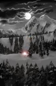
Mountain vista – full-page – from the Prologue (alternates)
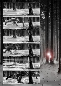
Chase sequence – full-page – from the Prologue (alternates)
Sample splash panel
The design process
In creating Holy Land: Resistance, we have developed a multi-tiered approach.
Taking the shooting script and conceptual designs as a starting point, we plot the story beats into chapters, and further into pages in each chapter, allowing for exposition and dialogue to be added later. We then storyboard each page, paying close attention to symmetry, flow and style, and being careful to ensure every page, panel and detail cohesively and dramatically pushes the narrative forward.
Following an appraisal period in which we assess the effectiveness of every aspect of the storyboards, artist Simon Newbury then shoots the photography and creates what we term as ‘Animatics’ – rough photographic storyboards in which we can again assess if every element is working correctly.
At this stage, writer Christophe Philipps applies roughly-designed dialogue bubbles and exposition panels, and add further ‘tie-in’ detail – unifying the style and tone of the chapter (and indeed, the novel as a whole) and overlaying extra visual ‘gags’. We also ensure the dialogue, exposition and illustrations complement each other to satisfyingly convey the narrative events. At this stage, the artwork often needs subtle re-working to balance with the dialogue and exposition.
With the dialogue, exposition and animatics approved, the final work to ‘finish’ the artwork takes place, with additional refinements to the positioning of the dialogue bubbles and exposition boxes.
See the gallery below for a step-by-step account of how Simon creates a picture – from storyboard to photography, layering, graphic effects and final rendering.

Tone & style
To read more about why we have developed the graphic style of Holy Land: Resistance in this way, as well as other useful info on bringing it to publication, click here.
Alternatively, you can find out more about writer Christophe Philipps and artist Simon Newbury here. Or if you like what you see, please get in touch.

